Community Embraces New Word Game at Mid-Year Play Day This past Sunday, families at Takoma Park’s Seventh Annual Mid-Year Play Day had the opportunity to experience OtherWordly for the first time. Our educational language game drew curious children and parents to our table throughout the afternoon. Words in Space Several children gathered around our iPads […]
Read more Mere words are insufficient to describe new web sites or mobile apps. Phrases like “access to information,” “online communities” and “interactive experiences” are ambiguous without a visualization.
Wireframes and sketches are the intermediary between a conceptual plan, and the actual, detailed prototypes and specifications needed to build a project.
Use quick, coarsely-drawn sketches to plan and discuss your next project. Create several views (e.g., a home view, and interior/secondary views) to flesh out the overall design of your site or app. The sketch embodies how it will work, and what the overall user experience will be.
Be fast and sloppy — Create the wireframes or sketches on paper, the back of a napkin, or on the computer. Use any tool you are good at: A pencil, PowerPoint, Photoshop, etc. Specialized “wireframing” software may be useful, but are not necessary. There are many styles (see below).
Cost effective — Creating a wireframe can be free (if you do it yourself), or a few hundred dollars (if you hire a freelance designer to work with you for a few hours). It pays for itself many times over by:
- (a) increasing the chance of a good result,
- (b) decreasing cost for a designer to create the final, meticulous prototypes,
- (c) reducing the chance of having to re-work the project later.
A concrete deliverable from a meeting — If you are having a meeting, consider having a designer (or visually-oriented person) work throughout the meeting to churn out a new wireframe every 5-10 minutes. Thus, the output of your meeting will be a concrete combination of a short written plan, plus some simple sketches — the two key ingredients you need to launch your project.
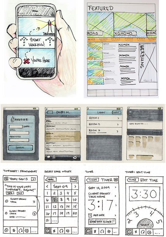
Sketchy sketches — Working quickly tends to lends a sketch-like appearance. Here’s some examples, of varying degrees of artistry. These were created by designers, but you can make a rougher version yourself.
(Sources: Rachel Hinman’s 90 Mobiles in 90 Days, Pixelhalunke, Harold Emsheimer, Anthony Armendariz)
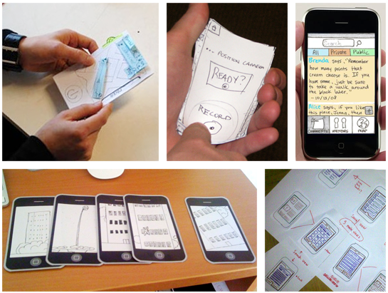
Paper mockups — Print out web sites, and bits of text from a word processor, cut them with scissors, and stick them on a board with tape. Use sticky notes and markets. Since mobile apps need to be operated by fingertips, it’s useful to make them real-size to test your ideas.
(Sources: Nat Geo GPS, Nick Romanos, inTouch Weight Watchers, a game app, DogVibes.)
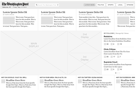
Schematics on your computer — Draw simple line diagrams using drawing software. Here’s a nice example for a Washington Post app:
You can mix and match styles. Also, it’s useful to cut up screenshots from existing sites. For example, if you are planning a new blog network, look at ten existing blog networks and news sites, and copy pieces you like from each place, and stitch them together with some simple boxes and lines.
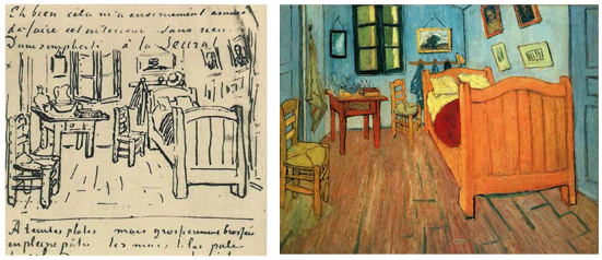
It’s just a sketch — Just like a charcoal sketch can be the precursor to many styles of art (realistic, impressionistic, etc.), the purpose of your wireframes is to guide the overall functionality and appearance. At a later step in the process, a designer will methodically refine the layout and flesh out the right feel and design. Often the final prototypes will evolve, but the wireframe will have embodied the core functionality you need. Below is van Gogh’s sketch and painting of his bedroom in Arles.
Only in the beginning — Wireframes and sketches are great for brainstorming and are vital in the early stages of planning. They help realize what needs to go into a project, and how it will work. But once the overall plan is in shape, it’s time to graduate. The sketches that helped launch and plan your project will now be a hinderance. Simple sketches obscure the user experience, and most people have trouble giving meaningful feedback to overly-abstract sketches.
So once your overall plan and sketches are done, have a designer flesh out visually-pleasing prototypes — with real sample text, real images, and a real design.
Great examples online — For more examples and inspiration, look at Jakub Linowski’s Wireframes blog, Hannah Milan’s collection of mobile wireframes at Moobleframes, a nice set of 25 wireframes and mockups compiles by Igor Ovsyannykov last week, Wolf Becvar’s Wireframe Wednesday, or the Flickr pool “I ♥ wireframes.”


