Community Embraces New Word Game at Mid-Year Play Day This past Sunday, families at Takoma Park’s Seventh Annual Mid-Year Play Day had the opportunity to experience OtherWordly for the first time. Our educational language game drew curious children and parents to our table throughout the afternoon. Words in Space Several children gathered around our iPads […]
Read moreTag: visualization
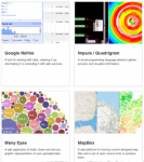
 Most data is meaningless to most people — unless it is visualized. Stepping beyond familiar visualizations like bar charts and pie charts, there are many approaches to visualizing data, from mapping (e.g., color coding a map to show voting patterns) to visualizing networks (e.g., the links between people).
You are not limited to Microsoft Excel, or your own programming abilities. We’re now in an awesome generation for visualization, with dozens of freely available software libraries — which developers have spent months (or years!) building. Increasingly these use Javascript (so they work in all browsers and mobile devices). The folks at Datavisualization.ch highlight most of the best tools for making maps and charts, or processing data… (more…)
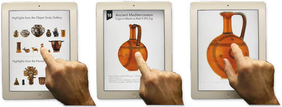
 A Hopi doll with painted headdress springs to life, spinning under my finger tips on a new iPad app from the University of Virginia Art Museum (UVaM).
The delightful app presents 19 different objects in 3D, to spin and zoom, providing an immediacy that rivals seeing an object in real life. In fact, it’s better in many ways than peering at an object through a protective case because the objects can be spun through a full 360°, view under bright lighting, at high resolution.
Personal exploration
The free app presents the mobile visitor with a grid of objects (below, left):

 Mere words are insufficient to describe new web sites or mobile apps. Phrases like “access to information,” “online communities” and “interactive experiences” are ambiguous without a visualization.
Wireframes and sketches are the intermediary between a conceptual plan, and the actual, detailed prototypes and specifications needed to build a project. (more…)

IDEA’s second mobile app, WikiNodes (see app store link) puts the encyclopedic knowledge of Wikipedia at the fingertips of iPad users. Articles are displayed as nodes that can be touched, dragged and spun around — showing the relations between articles and sections of articles. The app is currently featured in Apple’s app store.
Here’s a 30 second demo:
The app is based on IDEA’s SpicyNodes system for displaying and navigating information using nodes (see SpicyNodes.org). The SpicyNodes approach has great potential for other subjects, from browsing museum collections and archives, to browsing flora & fauna, and many other kinds of linked data.
Displaying only selected data provides clarity and enhances discovery. Problem You need to display quantitative information about an image, such as calories of foods, carbon dioxide output per country, or the number of voters per state. Solution Display a fixed key alongside the image, and display or highlight relevant data as the visitor points at
Interactivity helps explain why the sky is blue. Problem Some subjects are naturally difficult to teach, while others are perceived as tedious. Teaching through the use of static text and images leads to a passive learning experience that doesn’t engage students. As a result, students’ attentions wane and the information isn’t assimilated. Solution Introduce

